Hey guys!
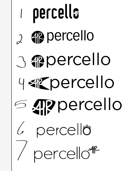
My groups theme was Modern Luxury to Percello Air. Our themes are being bold, modern, luxurious, clean typefaces that have a modern feel. My directions are mostly typographical. Currently im stuck on a marks and typeface direction. Let me guys know what you think!
5 comments:
I'm partial to 1, 2, and 5! I like the typeface for #1 (maybe a lighter weight?) the most. I don't think 6 or 7 really work, mostly because the distinguishing feature is so small it probably won't register well on things like business cards etc. Which also could happen with #1.
I'd say refine 1, 2/3, and 6! I think they are the strongest! (Nice 'air' symbol, btw!)
thanks! i was writing it myself on my sketches and i took a photo of it and traced it in illustrator. Im going to try to find more modern/luxurious fonts. to refine my logo. thanks for all the feedback rachel! :D
Modern luxury appeals to a more conservative audience. Think about people who are older, almost like cadillac owners. I would think about using #6 with a capital P, and ponder a new way to display the Air symbol from #3 after the word. It currently looks a little too fifties-ish luxury.
I like number 7! Its cute and fun. The lowercase 'percello' definitely shows that. Plus the 'air' is fun and firty. Anything small and cute is a plus in my book
thanks erik and rachel!
Post a Comment
Note: Only a member of this blog may post a comment.