Recent Posts

Thursday, April 7, 2011

Ads


Hey guys!

So, I've been working on my ad since I got home after class and I think this is what Erik was talking about. I really want to know what everyone thinks!

Tuesday, March 29, 2011

Help!!

Hey guys! I don't know how to crop the picture to fit perfectly into the rounded rectangle box for my homepage. If anyone knows how to, please help!Thanks!!!

Friday, March 25, 2011

Website Draft

Hey guys! Can you tell me what you think of these pages? I've been looking at them so long I can't tell if they are good anymore. Please be as brutally honest as you can; otherwise I'll figure these are fine haha. In retrospect, I should have outlined them so you could see the boundaries.


Friday, March 18, 2011

Splash page and Homepage Percello Air


Hey Everyone! These are my homepages so far. The one with the Airplane is my splash page/welcome one and the map is showing off destinations on where you can go. Let me know what you think!
-Andrew

Thursday, March 17, 2011

Personal Resume and Business card (feedback please!)


I'm working on making my Resume and Business cards for the portfolio review April 2nd and would like all of your opinions! Thanks!
-Andrew


Monday, March 14, 2011

Percello Wireframe (filled in homepage)

So, my Percello is supposed to be targeted towards a somewhat hipster-esque audience. I'll post my first and second version here, just for comparison. Before we left for break, Erik said it was "too cutesy", and I wholeheartedly agree. I just think I'd been playing too much Angry Birds or something. Anyway, here you go (the black line is supposed to be the cutoff for what you first see when you visit the page):


Monday, March 7, 2011

Percello Wires

Here are my 'wires' for class tomorrow. Is this what we're supposed to be doing?? He said have three ready, so I did four pages for the same website concept (instead of four individual pages for four different concepts). Any thoughts? (and obviously the colors are just filler. My site with definitely NOT be covered in that bright blue!)


Saturday, February 26, 2011

Business Cards


These are business card ideas I've come up with but I don't have one I'm particularly leaning towards. So, opinions? They are in pairs - left is front side and right is the back.

Monday, February 21, 2011

Color Directions.

Just some of the color options Ive started working on. im making more variations and experimenting.

Color Choices?


Hey Everyone,
What do you think of my color choices/placement of the colors? Any input would be appreciated :)

Distressed Logo Follow-up

Hey guys! So about that logo I've been working on....
Here's what I've come up with, per their request for a 'distressed' look. What do you think of it? What do you think of the base mark in general? Too plain? Too stupid? I'd like to know :)

p.s. This is a sad, low-res raster version because I'd had it saved as a pdf on my computer, so I just screen-shot that janks to post it here.

Thursday, February 17, 2011

Freelance: Opinions Please!

Okay so I'm doing a small freelance gig for a church in Burke. They aren't paying much, so I'm not allowing myself to spend all my time making it. They want a logo made from the initials of the church: "BCC"

I've been having a hard time integrating the letters, because they first wanted a logo something like the one at this church's site: the "WC" at the top

After I sent them some concept sketches, they asked for a different direction (guess they didn't like em). So they asked if I could use a font like THIS or THIS. I told them I couldn't use a webfont, but that I would make them something.

So what I'd like to know from you guys is:
1) How do you get that stupid distressed effect in vector form?? I can do it in photoshop on raster stuff, but I've never done it in illustrator.
2) Should I make my own font completely, or use an existing (not web) font and just distress it?

Thanks guys! I'm a little confused by this request, because they asked something totally different from me at the first meeting. Go figure. :)

Wednesday, February 16, 2011

Percello Air Logo Board


Logo board with mark and logo sizes. Any thoughts?

So this is the logo I've decided to go with but in class I didn't get any real suggestions about refining it. Besides obvious tweaking (making the curve look aligned with the dot at the end) are there other things I should change? Font...weight.. eh?

The way my group interpreted the airline was simple and light. Taking out all the hassles of flying, the service isn't meant to put much attention on the flight itself but on getting you where you're going. So that's where I was trying to go with the logo. Nice and light, and the "A" is supposed to be the "light flying experience" and the dot at the end is the emphasis on where you're going.

Final Logo HELP


Here are the cleaned up logos I worked on after the critique. I want to know what you think! :)

Tuesday, February 15, 2011

Logo Final Draft?


Hey Everyone,
So here is the final draft that I have at the moment of the logo. I made all the revisions that he seemed to want in class, so what do you all think? Does it look good? Would you fly on this airline? :P

Sunday, February 13, 2011

What is due on Tuesday

So, I know we have a mounted piece of work due, with three logo designs, but when I have been designing, I have designed the full name 'percello air' and the 'pa' for the short version as a pair. What should we include for what is due Tuesday?

Logo Redesign

I need help identifying this font. The designer before me left and didn't tell anyone what it was.


Saturday, February 12, 2011

Logo Advice, MUCH NEEDED


Okay, these are the two font choices I have narrowed down, and shapes and stuffs. Advice is really appreciated!!

Percello Air Logo Roughs


Hey Everyone! So here are my 3 works in progress. I would love it if you all could tell me what of the three typefaces you like best, what logo you like best, and what you think about the symbols. I seem to be having the hardest time working on them so they look decent......Anyways, my Percello Air is about simplicity, minimalism, and traveling light. We are all about getting you to the destination hassle-free.

Thanks for the input!

-Scott

Friday, February 11, 2011

Percello Air Logo Concepts


Hey guys!

My groups theme was Modern Luxury to Percello Air. Our themes are being bold, modern, luxurious, clean typefaces that have a modern feel. My directions are mostly typographical. Currently im stuck on a marks and typeface direction. Let me guys know what you think!

Thursday, February 10, 2011

Percello Air Logo Directions

Okay, okay, so it hasn't even been two hours since this class let out, but I'm excited to finally get some real posts on here! I might as well go first, since I'm taking the blame for the whole blog :)

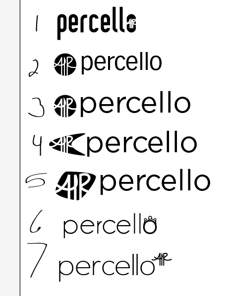
For those of you not in AVT 414 with me, the concept my group decided to go with is a custom and personalized flying experience ("Fly personal, fly Percello!") that is playful, aimed at 25-30 year olds, and offers competitively priced tickets to major cities around the world.

Here are the three directions of logos I have in mind for Percello Air.

The tear-drop shape is a reference to "you-are-here" symbols, and in option 1, the curves imply a rainbow of sorts that lead to the point indicated by the tear-drop. The idea is similar to that of options 2a & 2b.

My questions for you guys:

- Of these, which do you think is designed the best?
- Of 2a & b, which do you prefer? I'm torn between the placement of the dots.
- Do these look like anything you have seen before?
- Am I missing something crucial? Do any of these form a lewd shape? Is there some obvious symbolic oversight I have made?

These aren't finalized, but I need to have narrowed the choices down the three by Tuesday, and I'd like to already have a preference for one.

Thanks everyone!

Wednesday, February 9, 2011

Labels

To make archiving this blog thing easier, I'm making labels for posts so everything can be sorted according to categories. If you haven't used blogger before, the place to do this is below the box where you type a new post, and above the 'publish post', 'save now', and 'preview' buttons. Click "See All" and select the ones that apply to your post. I'm tagging this entry with all the labels I can think of so we can have them ready to use. You can add more if you need!

P.S. As of tomorrow, I'll definitely have some stuff to show you guys. Logo design isn't my strong-suit, but that seems like all I'm doing right now!

Shortening the Link

I tried to shorten the link to this site, but all I got was: http://bit.ly/gW97fu
So typing that in will also direct here. For all you twitterers.

Tuesday, February 8, 2011

Room 1022 Start Up

Hello to all you trusted designers! This is going to be an open blog for us to post any projects we want to show off and/or get feedback on! If you know a designer whom you can always count on for help, invite them to join! Once I figure out how to do it, I'll make it so everyone is a collaborator on the blog. For now, you can make a blogger profile if you don't already have one and soon enough we'll get this rolling!

Thanks for being a part of this :) I, for one, am really looking forward to making you all critique my design shit. Hooray!